The quiet formula behind every room that works
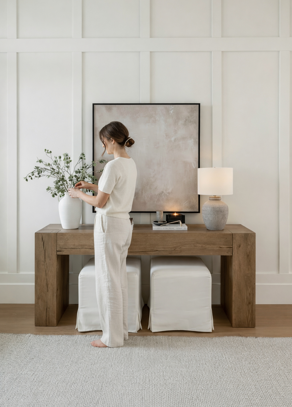
Some rooms simply land. You walk in and everything feels considered—balanced without being calculated, layered without being loud. There’s no single statement piece demanding attention. Instead, a conversation. Tones that build on each other. Colors that know their place.

This isn’t accident. It’s arithmetic. The 60-30-10 rule is one of the oldest principles in interior design—borrowed, as many of the best ideas are, from a neighboring discipline. Its origins trace to color theory and the visual arts, where painters and graphic designers long understood that color harmony depends not just on which colors you choose, but on how much of each you use. A room, like a canvas, needs hierarchy. Without it, the eye has nowhere to land.
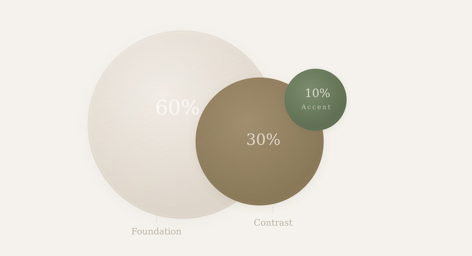
The concept is deceptively simple. Divide the visual weight of any room into three proportions: sixty percent for your dominant color, thirty percent for a secondary tone, and ten percent for an accent. That’s it. No complex wheel, no need to memorize complementary pairs or split triads. Just three numbers and a willingness to trust the ratio.
What makes this rule endure—across decades, across styles, from mid-century modern apartments to quiet Scandinavian farmhouses—is that it doesn’t prescribe taste. It prescribes structure. You can fill that 60% with warm plaster or cool concrete. Your 30% can be walnut or matte black. The 10% might be burnt sienna this season and forest green the next. The palette is yours. The proportion is universal.
Think of it as the grammar of a well-dressed room. Grammar doesn’t tell you what to say—it tells you how to say it so people understand. The 60-30-10 rule works the same way. It doesn’t choose your colors. It makes sure they land in the right order, at the right volume, so the room reads as one cohesive thought instead of a collection of competing ideas.
The Numbers
Designers have long relied on a ratio that sounds clinical but reads as instinct: 60-30-10. Three numbers. One foolproof framework for rooms that feel finished without trying.
60% The Foundation
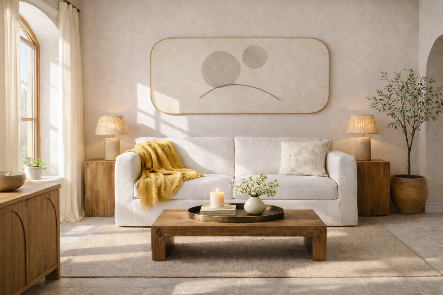
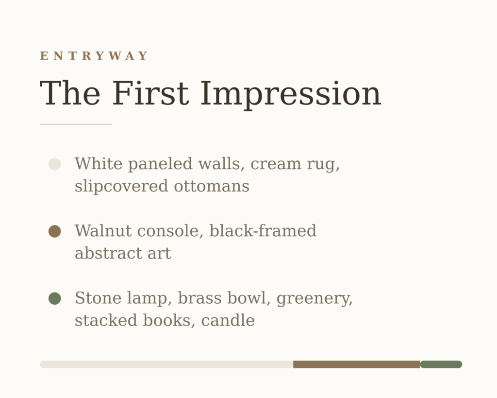
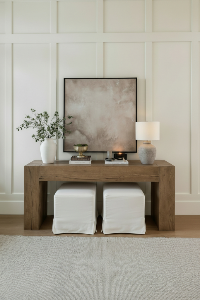
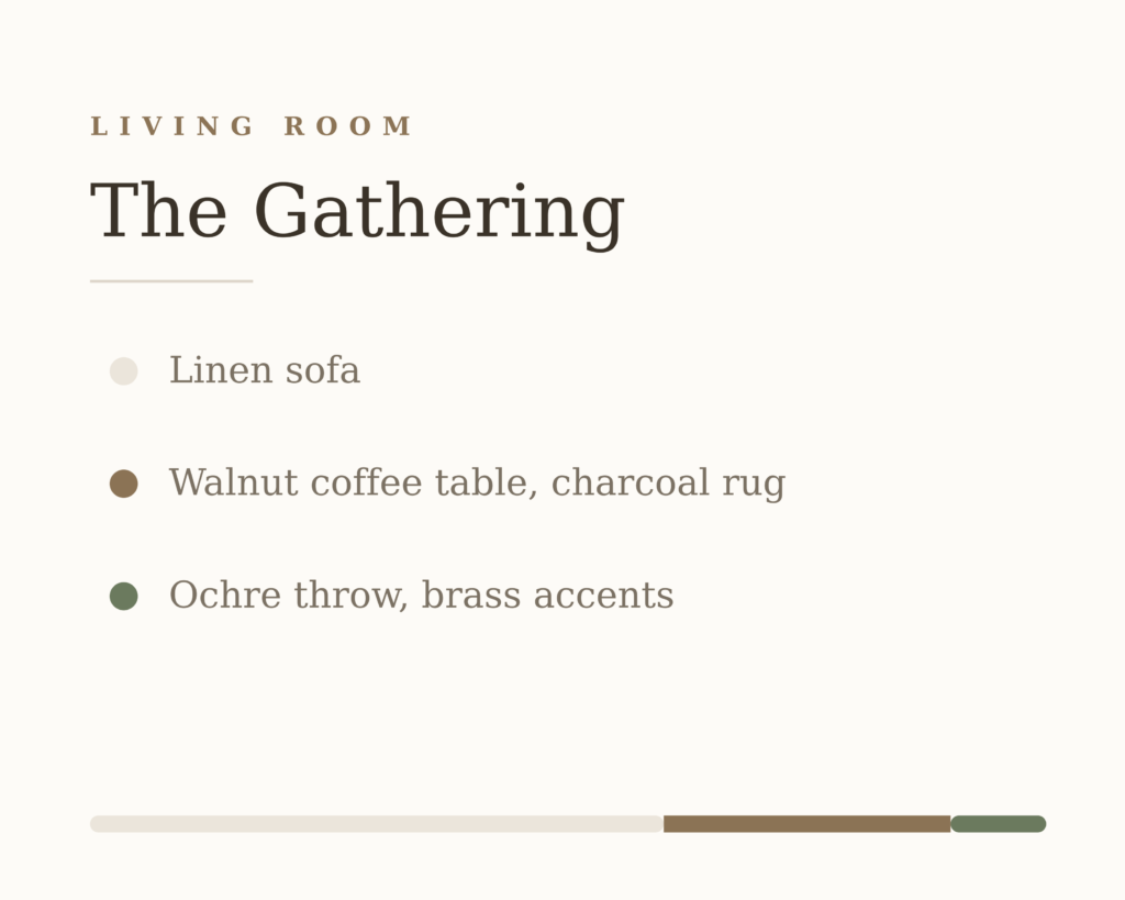
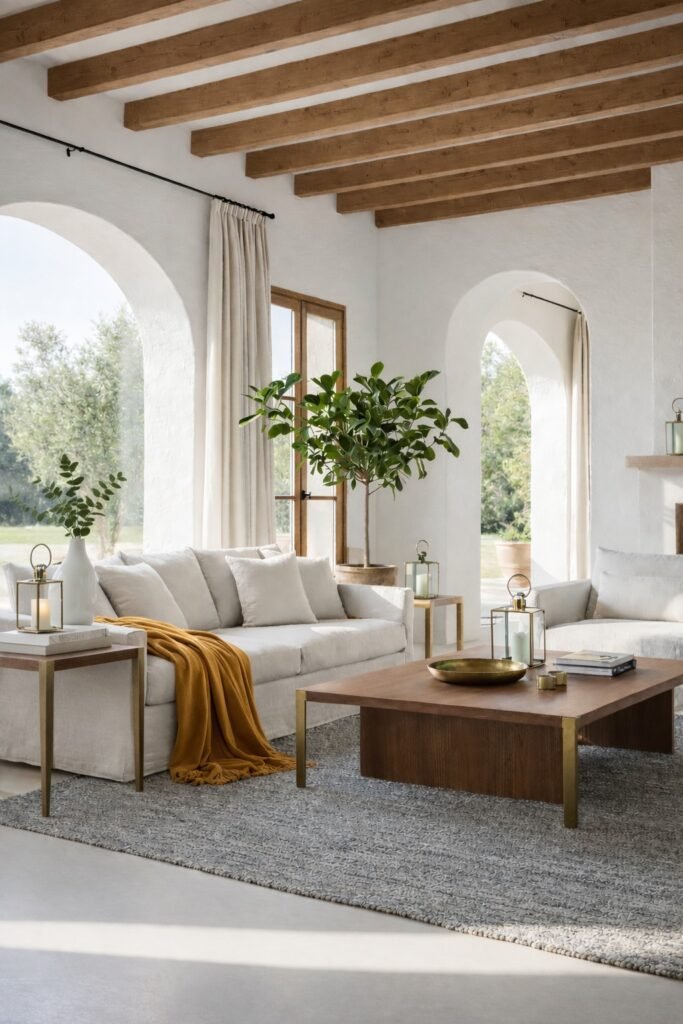
Your dominant tone. The quiet that holds the room together. Think walls, large upholstered pieces, rugs that anchor rather than compete. These are your neutrals—warm whites, soft taupes, greyed linens, plaster pinks, stone. The shades you stop noticing because they simply are the room.
30% The Conversation
Your secondary layer. Darker, deeper, or simply distinct enough to create contrast without conflict. A walnut console against an ivory wall. Charcoal linen curtains. A cognac leather chair that grounds a pale room. This 30% gives the eye somewhere to travel—and a reason to stay.
10% The Punctuation
Your accent. The color that makes the room memorable. An ochre throw draped across a white sofa. A candle flickering on a brass tray. A bud vase of fresh stems catching afternoon light. Small, strategic, impossible to ignore. This is where personality lives—but only because it’s earned its quiet entrance.
Why It Works
The ratio succeeds because it mirrors how we naturally perceive balance. Too much color overwhelms. Too little feels unfinished—like a sentence without punctuation. The 60-30-10 rule builds visual rhythm: a foundation to rest on, contrast to create depth, and just enough accent to make it yours.
It also grants permission. Permission to keep walls neutral. Permission to invest in that statement vase instead of repainting. Permission to change your mind—swap the 10% seasonally, and the room reinvents itself without renovation.
Swap the 10% seasonally, and the room reinvents itself without renovation.
Room by Room
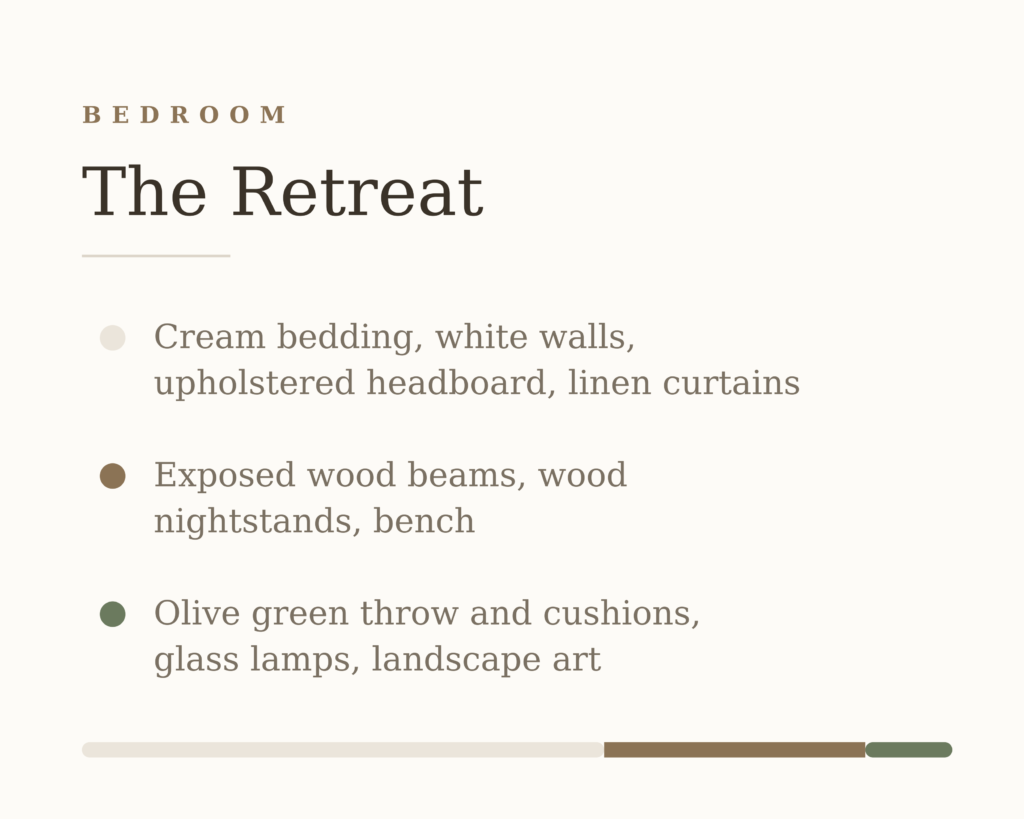
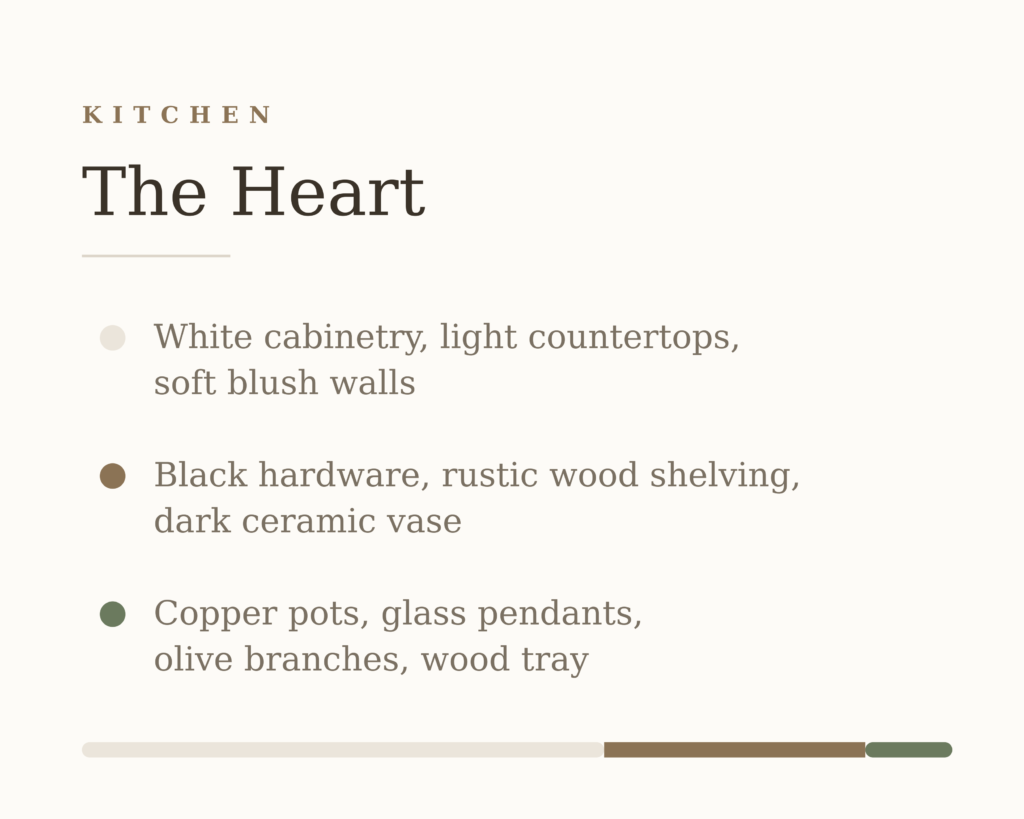
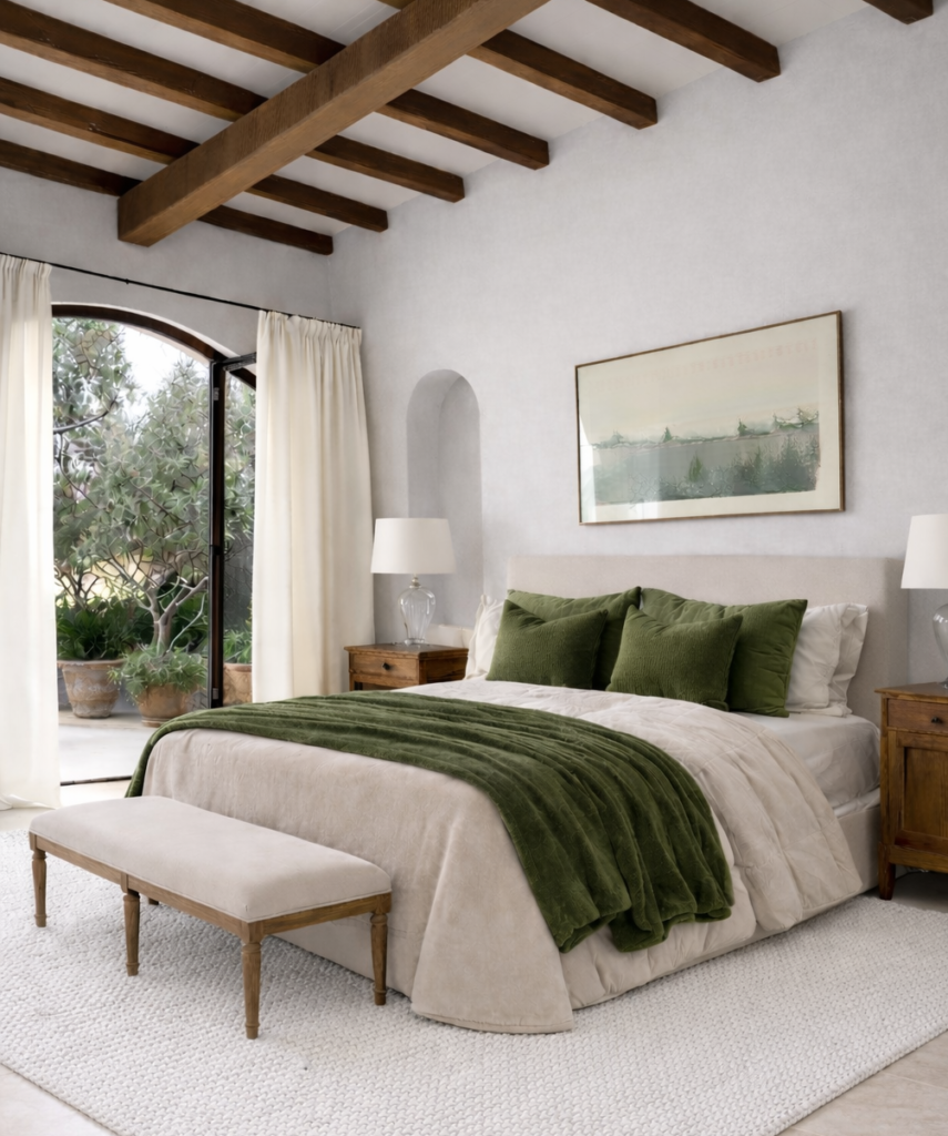
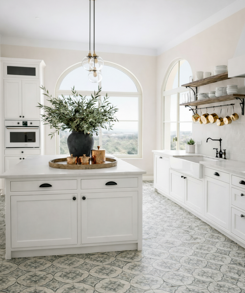
The Unspoken Rule
The best rooms never announce their formula. The 60-30-10 disappears into the design—felt, not seen. It’s not about perfection. It’s about proportion. About trusting that restraint creates room for the pieces that matter.
Start with the 60. Build with the 30. And let the 10 do the talking.
The 10% Edit
Every room in this article shares the same quiet architecture — a foundation, a conversation, and just enough accent to make it memorable. These are the 10% pieces. The ones worth investing in, swapping seasonally, or simply letting catch the light.
Start with one. The room will tell you what it needs next.
Living Room
- Ochre throw | $29.69
- Brass accent tray | $29.99
- Sculptural bud vase | $42.98
Bedroom
- Glass table lamp | $189.99
- Velvet Quilt | $162.99
Kitchen
- Olive Branches | $45.99
- Copper canister | $78.00
- Black rustic vase | $48.99
Entryway
- Stone ceramic lamp | $129.99
- Brass bowl | $75.43
- Artificial Ficus stems | $13.99
- Architectural Design Book | $87.94
The Good Living Edit is built on one principle: design should serve the life inside it. Every product we feature has been researched, evaluated, and chosen with the same intention we bring to our own homes — because that’s exactly where this started. Interior design isn’t decoration. It’s decision-making. And the best decisions are always the informed ones.